Tuesday, November 30, 2010

Another i-phone


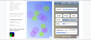
While researching for the I-PHONE app project, I found some awesome apps on the apple website. I'm sure many students have visited the apple site, but I'm not sure if anyone has found this one.
It has tons of different apps in many different categories. It has a brief description below each app along with the actual icon next to the phone. I love this setup. You can click on the different apps and it shows you different pages that you may encounter while using the app. Some allow you to scroll and experience the whole app, and some only have a couple pages.
I found this site to be really helpful in designing my app. I couldn't believe the amount of information you can put onto a tiny phone and make it work at the same time! It's crazy.
Ashley
I-PHONE APPS


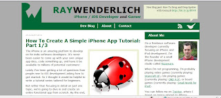
Since we are in the process of creating an i-phone app, I wanted to do some research and figure out what goes into creating an app. I found this site that goes through the basic information for beginners.
I found this really fascinating to learn some information about how to create something I use almost everyday. It shows you some code that is required as well as the design of the layout of these apps. I don't think I will be using any of this information in the near future, but I hope some other people will read this and find it helpful.
Ashley

Scrolling Effects


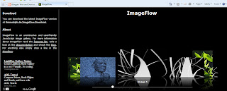
This is a site I found that has different effects you can use for scrolling through images. The lightbox effect is very overused and I am interested in new ways of displaying my works.
This specific effect is pretty interesting, but not the best. I like that you can take the ball on the bar at the bottom and scroll through many photos. It goes a little too fast for me, even when I try to go extremely slow. I also do not like the way it enlarges the photos. I do not want to be taken to another window. I think if you hover over the image it should just get larger on the same screen(if that's possible).
With a little work to perfect this effect, I think I would use it to show some of my photos.
Ashley

Thursday, November 18, 2010

E-COMMERCE/INTERACTIVE WEBSITE


www.ikea.com

This is a site i'm sure almost everyone has been to. They have so many products, but have it organized in such a neat way that doesn't confuse me and I am capable of finding what I am looking for.

I also love the way they have the large photos like the one to the right. There are little plus signs throughout the photograph that you can click on. It then zooms you in for a closer look at, for example kitchen cabinets. I think that is extremely neat and very important so the viewer can see what they are buying.

Overall, I think this site is successful because of the neat way it is organized and the little effects that help the viewer see what they are going to buy.

Ashley

http://jeannieweb.com/

I chose to write about this website because if the unique way the navigation is laid out. The design is kind of weird for a design agency, but I was intrigued by the way each section of the site was incorporated into the image. The "portfolio" link especially. It is on the suitcase, which could represent a portfolio case. Again, this is not your standard site. The site is just one main image with different pieces to it.

I like to see people creating different ways of laying a whole site out because it gets very repetitive after a while. There is no difference between many of the most popular sites out there right now. We as Americans get very bored with things and i think it is important to discover new ways of keeping their attention.

Ashley

Hard To Navigate Website


www.adhemas.com

I think this is the least successful navigation I has ever seen on a website. Maybe it's user error, but it took me way too long to figure out how to even get a different part of the site to pop up. Once I figured that out, the only way for me to see more was to click this "x" button (that was extremely hard to see) then it would make the different pages smaller and then you were able to see more than just one page. You would then be able to click on another page. After I figured that out, I then realized you could use your mouse to navigate up, but going down was impossible! I would recommend clicking on this link and try navigating through. Maybe you will have better luck with it!

I'm not sure if this was created in Flash or another program, but it was way too confusing and not user friendly. I would never suggest anyone do their website like this person. The designs were nice though!

Ashley

Colloquium Show


www.colloquiumshow.com

So this is a site I worked on with Garrett Haas. It is for a student exhibition that is taking place at The University of Akron. I chose to write about this site because of the unique way the images are laid out. Many sites have just one main image with a little bit of information on it. This site has numerous images that show a little bit about each section of the entire site. It really takes my eyes throughout the entire site instead of just focusing on one particular image. Each image is a link and will take you to the appropriate page.

I also really enjoy the rotating photographs of each artist. This part I did not create, but It is another part of the site that captures the viewers attention.

Overall this site is is successful because of the unique layout with numerous images throughout the entire page.

Ashley

http://www.noeldesign.net/index.php

This a a random designers portfolio website. I chose to write about this because of the way he incorporated the graphics. They look similar to some handcrafted pieces of art. So it gives me a sense of actual handmade art that is also digital.

Another reason I chose this site is because of the way he set up his portfolio. It is neatly set up on the page. They are large thumbnails and to the side he listed a brief description of the project. I think descriptions are very important for a project. Sometimes you have no idea what the project is about. Then he has a link that you can click on and view the entire project.

This site has a unique way of incorporating old art with new art. I also really enjoyed the nice simple way to show off your best works as a designer.

Ashley