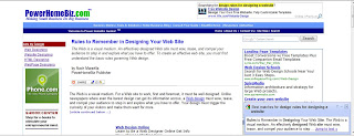
This site has some basic information about designing a website. It just explains what we all should know already, but it is good to have some solid information that you can go back to while designing new sites. It also talks about how different sites need different visuals and information according to the companies main goal.
Something that I really agree with is the fact that the web is for surfing. People like to skim content on a page. They don't read everything and the content on the page must be so successful and staright to the point that the viewers can understand your point without reading everything. One thing I have realized this semester is that people do not like to read. I feel that the images should be so impactful that the viewer can know what you are trying to say without even saying it.
Overall, I think this site is helpful to have in your bookmarks. You never know when you're going to need this information and when it can be helpful.
Ashley Matejka
No comments:
Post a Comment